Section 1
The first lab among the suite of climate-literacy labs had us standing on the Earth’s surface, basking in the warmth of the sun, and trying to understand how the solar radiation that gives us that warmth changed over time (the seasons) and space (latitude). In the second lab, we journeyed out into space, stopping at the layer of the atmosphere that exists between 20 and 50 kilometers out: the stratosphere. While there we were interested in what happened to a key component of that solar radiation – the part making up the ultraviolet portion of the electromagnetic spectrum – and how a change in the composition of a critical gas in the stratosphere – ozone – was affecting that, as well as affecting life down on the Earth’s surface. In today’s lab, our journey through the atmosphere takes us back down to the layer in which we live – the troposphere – and, for at least part of the time, we will be interested in ozone again. However, we will see that it plays a different role in this different layer, and what that role is will be important to understanding the quality of the air we breathe. After that, we will look more broadly at the substances that make up the troposphere and, sticking with one of our key themes in this course, consider changes in the concentrations of those substances across space – both vertically (as you move up in the troposphere) and horizontally (as you move across the surface of our planet). The lab ends with an examination of how the concentrations of pollutants in the troposphere over the United States have changed over the past several decades.
By the end of this lab, you should be able to answer the following research questions:
-
How does the troposphere differ from the stratosphere?
-
How does the composition of the troposphere change with a change in altitude and latitude?
-
How and why have pollution levels over the United States changed over the past several decades?
__________________________________________________________________________________________
Entering with the right mindset
Throughout this lab you will be asked to answer some questions. Those questions will come in three different varieties:
Fact-![]() based question →This will be a question with a rather clear-cut answer. That answer will be based on information (1) presented by your instructor, (2) found in background sections, or (3) determined by you from data, graphs, pictures, etc. There is more of an expectation of you providing a certain answer for a question of this type as compared to questions of the other types.
based question →This will be a question with a rather clear-cut answer. That answer will be based on information (1) presented by your instructor, (2) found in background sections, or (3) determined by you from data, graphs, pictures, etc. There is more of an expectation of you providing a certain answer for a question of this type as compared to questions of the other types.
![]() Synthesis-based question → This will be a question that will require you to pull together ideas from different places in order to give a complete answer. There is still an expectation that your answer will match up to a certain response, but you should feel comfortable in expressing your understanding of how these different ideas fit together.
Synthesis-based question → This will be a question that will require you to pull together ideas from different places in order to give a complete answer. There is still an expectation that your answer will match up to a certain response, but you should feel comfortable in expressing your understanding of how these different ideas fit together.
![]() Hypothesis-based question → This will be a question which will require you to stretch your mind little bit. A question like this will ask you to speculate about why something is the way it is, for instance. There is not one certain answer to a question of this type. This is a more open- ended question where we will be more interested in the ideas that you propose and the justification (‘I think this because . . .’) that you provide.
Hypothesis-based question → This will be a question which will require you to stretch your mind little bit. A question like this will ask you to speculate about why something is the way it is, for instance. There is not one certain answer to a question of this type. This is a more open- ended question where we will be more interested in the ideas that you propose and the justification (‘I think this because . . .’) that you provide.
__________________________________________________________________________________________
Section 2
We live in the troposphere, and similar to the stratosphere, it is comprised of gases, particulates, and droplets. As can be seen in the comparison of the pie charts below, the major differences between the stratosphere and troposphere are the concentrations of ozone and water vapor: the stratosphere has much higher concentrations of ozone than does the troposphere, while the troposphere has much higher concentrations of water vapor than does the stratosphere.
![]() Q1: What are the two most abundant gases in both the stratosphere and troposphere?
Q1: What are the two most abundant gases in both the stratosphere and troposphere?
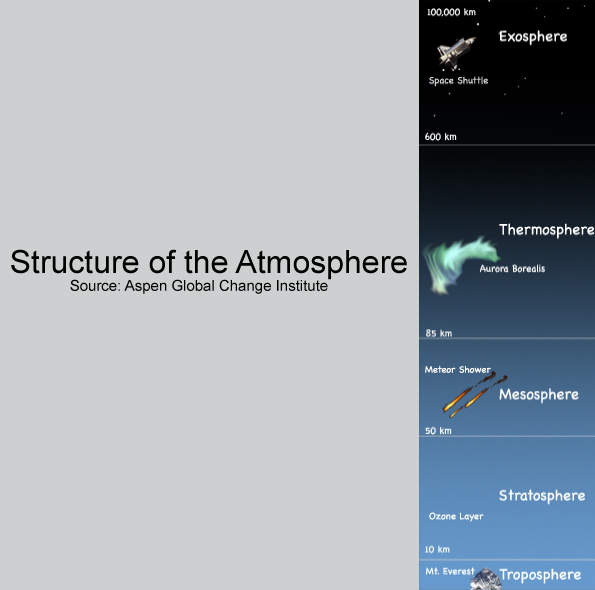
The troposphere is not very thick: it ranges in depth from just 6 km at the poles to 20 km at the equator. The average thickness in the middle latitudes is approximately 17 km. The images below provide insights into how shallow the troposphere is. For instance, the Structure of the Atmosphere figure displays the relative thickness of each of the layers of the atmosphere.
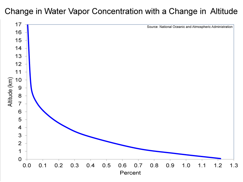
Compared to the other layers of the atmosphere, the troposphere has relatively high concentrations of water vapor and particulates. Particulates, which are also known as aerosols, are extremely tiny pieces of solid or liquid matter. The far-left image below shows a sand storm beginning in the Sahara desert; such wind-blown dust from natural sources, represent one of the largest particulates in the atmosphere. (It is worth pointing out that particulates from dust storms can travel as far as the Caribbean Sea.). The second image from the left shows particulates being ejected by Mt. Pinatubo in the Philippines. Very explosive volcanic eruptions, such as the Mt. Pinatubo eruption in 1991, can actually inject particulates into the stratosphere. Other major sources of particulates in the troposphere, besides deserts and volcanoes, are fossil-fuel combustion and biomass burning. Both water vapor and particulates are needed for clouds to form; therefore, nearly all clouds occur in the troposphere. One exception is polar stratospheric clouds, which you observed in the Stratospheric Ozone lab. Please examine the graph (the third picture from the left below) which shows the change in water vapor concentration with a change in altitude. From this graph, you should be able to see that water vapor concentrations in the troposphere decrease rapidly with an increase in altitude. This is because Earth’s oceans are the overwhelming source of water vapor. The decrease in concentrations of water vapor with an increase in altitude does not mean that the upper troposphere is less cloudy than is the lower troposphere. The formation of clouds is a complex process; at any one time, clouds cover 60% of the globe (see the right-hand image below, which shows clouds covering a portion of the Earth).
![]() Q2: Compared to the other layers of the atmosphere, of what does the troposphere have high concentrations?
Q2: Compared to the other layers of the atmosphere, of what does the troposphere have high concentrations?
Section 3
In order to successfully complete the measurements and calculations in the next part of the lab, you have to understand the relationships among the concepts of percent, parts per million (ppm), and mass. You were shown percent information in the pie charts showing the gaseous compositions of the stratosphere and troposphere. For example, approximately 77.69% of the troposphere is nitrogen and 20.84% is oxygen. Out of a sample of one million molecules in the troposphere, 776,900 would be nitrogen and 208,400 would be oxygen. Therefore, the concentrations of nitrogen and oxygen are 776,900 ppm and 208,400 ppm, respectively. The table below shows conversions from percent to ppm. The concentration of water vapor decreases with an increase in altitude. The average concentration of water vapor for the troposphere is 0.46%, while the average concentration for the stratosphere is 0.0005%. The concentrations in ppm are 4,600 ppm and 5 ppm, respectively. If a gas has a low concentration, it is easier to express its concentration in ppm, rather than percent. In future exercises, you will encounter gases present in very low concentrations, with the concentrations expressed in parts per billion (ppb) and parts per trillion (ppt). For example, the concentrations of the ozone-depleting substances you examined in the Stratospheric Ozone lab are expressed in ppt; these gases are present in extremely low concentrations in both the troposphere and stratosphere.
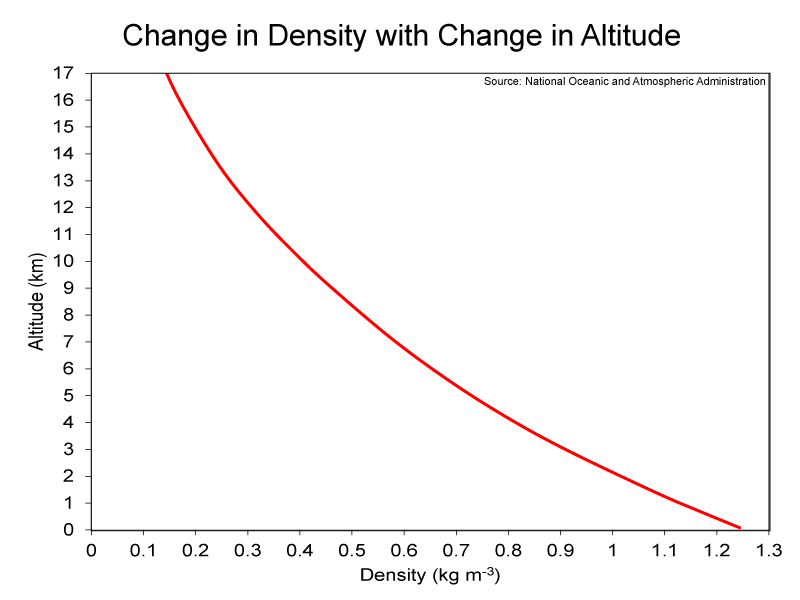
Percent and ppm are relative terms; therefore, they do not provide information on exactly how much (e.g., mass) of a certain gas is within a given volume of air, such as one cubic meter of air. For example, in this lab, we will be exploring the density of air, which will be the mass in kilograms per one cubic meter of air; the units will be kg m-3. Atmospheric pressure is needed to calculate the mass of air and the various gases that comprise it. Atmospheric pressure is defined as the force per unit area (e.g., square meters) exerted into a surface by the weight of air above that surface. A graph showing the decrease in pressure with an increase in altitude is shown below (left-hand image). The average pressure at sea level is 1,012 hectopascals (hPa), while the pressure at the top of the troposphere is less than 100 hPa. Therefore, atmospheric pressure decreases rapidly with an increase in altitude. And as atmosphere pressure decreases so does the density of air. Examine the right-hand image below to see this change in density with change in altitude; you should note how it mirrors the left-hand graph. Less air means less resistance. This is why kicked footballs go farther at “Mile High” Stadium in Denver, which is located at 1,587 meters above sea level, than at any other professional football stadium. The reduced atmospheric density at Denver also causes athletes to have access to fewer oxygen molecules. The concentration (i.e., ppm or percent) of oxygen undergoes trivial changes throughout the troposphere, but the rapid decrease in pressure is associated with a rapid decrease in the number of oxygen molecules for a given volume of air. Consequently, there is nearly 20% less oxygen available at Denver compared to a location at sea level. Teams playing the Denver Broncos at “Mile High” Stadium have more trouble breathing than do the Broncos, because players on the visiting teams are not acclimated to the lower oxygen levels.
![]() Q3: What percent of the global atmosphere is carbon dioxide (CO2)? Lab 4 and other subsequent labs have an emphasis on CO2.
Q3: What percent of the global atmosphere is carbon dioxide (CO2)? Lab 4 and other subsequent labs have an emphasis on CO2.
![]() Q4: How do atmospheric pressure and density change with an increase in altitude?
Q4: How do atmospheric pressure and density change with an increase in altitude?
Section 4
You are going to obtain data to determine characteristics of three levels of the troposphere: the surface, the middle troposphere, and the upper troposphere. Weather data will be obtained from measurements made via a weather balloon launched at 7 A.M. or 8 A.M. at an airport (most likely). The weather instrument attached to the weather balloon is known as a radiosonde. Another balloon is launched at 7 P.M. or 8 P.M. There are approximately 800 launch sites globally; therefore, approximately 1,600 weather balloons with radiosondes are launched each day. A picture of a weather balloon and radiosonde ready to be launched are shown below. The balloon, which is either rubber or latex, is filled with either helium or hydrogen, and the maximum altitude to which the balloon ascends is determined by the diameter and thickness of the balloon. The decrease in pressure with an increase in altitude causes the balloon to expand as it ascends. The balloon eventually “pops,” and the radiosonde, which has a parachute attached to it, falls back to the surface. Less than 20% of the approximately 75,000 radiosondes released by the U.S. National Weather Service (NWS) each year are found and returned to the NWS for reconditioning. Check out this site to see what radiosondes look like and to learn what to do if you find one.
Click Troposphere_Data to open the file in Microsoft® Excel. Instructions for obtaining data from a radiosonde launch are provided on the Altitudes sheet. Input your data in the spreadsheet. Proceed through the sheets in the following order: (1) Altitudes; (2) Weather Data; (3) Carbon Dioxide; and (4) Density and Mass, and (5) Sea Level Pressure. If you have access to instruments that measure altitude, pressure, temperature, relative humidity, and CO2 concentrations, then we recommend you take a break from staring at this screen and go outside to make some surface measurements. The TAs for students in Geography 1112 will show the students how to use the Kestrel weather instrument and a CO2 monitor.
• All yellow cells need values.
• Values are calculated for all non-yellow cells that do not have either “0” or “#VALUE!”.
![]() Q5: Why do you think temperatures are higher at the surface than at the middle and upper portions of the troposphere?
Q5: Why do you think temperatures are higher at the surface than at the middle and upper portions of the troposphere?
![]() Q6: How would you describe the change in air density with an increase in altitude and how does that compare to what you learned in the previous sections?
Q6: How would you describe the change in air density with an increase in altitude and how does that compare to what you learned in the previous sections?
![]() Q7: Which gas had the largest proportional increase in mass when moving from the upper troposphere to the surface? Why?
Q7: Which gas had the largest proportional increase in mass when moving from the upper troposphere to the surface? Why?
The fifth sheet (Sea Level Pressure) converts the surface pressure you obtained or measured and converts it to an equivalent pressure at sea level. If you are at sea level, then no changes have been made to the surface pressure. If your location is above sea level, then the sea level pressure (SLP) for your location is higher than the surface pressure. If your location is below sea level — which is not very common, then the sea level pressure (SLP) for your location is lower than the surface pressure. The mean sea-level pressure (SLP) for the globe is 1013.2 hPa.
![]() Q8: Why was your surface pressure higher or lower than the SLP of your location?
Q8: Why was your surface pressure higher or lower than the SLP of your location?
The atmospheric values, such as surface pressure, you just collected are always changing and may be dramatically different tomorrow. This is an example of weather, which is much different than climate, the main emphasis of the labs. An example of a climate variable would be the average (i.e., mean) surface pressure of your location over the past several decades. Although you looked at data for just a single day, your answers to Question 5, 6, and 7 would always be the same for all days. Let’s look at sea-level pressure in the context of weather and climate for Atlanta, GA USA. The mean sea-level pressure for Atlanta over the 1973-2014 period was 1018 hPa, which is a bit higher than the mean global sea-level pressure of 1013.2 hPa. The highest sea-level pressure observed in Atlanta was 1041.8 hPa on 13 February 1981. A few years later, the lowest sea-level pressure of 992.2 hPa was observed on 28 March 1984.
![]() Q9: What two different weather phenomena were responsible for the extremely high pressure and the extremely low pressure at Atlanta?
Q9: What two different weather phenomena were responsible for the extremely high pressure and the extremely low pressure at Atlanta?
Click on the image below to see the weather maps for the two days with extreme pressure values. A surface high-pressure system, which is also called an anticyclone, is often caused by downward motion through the troposphere and is often associated with calm conditions and cloud-free skies. A surface low-pressure system, which is also called a cyclone, results from air rising from the surface to higher levels of the troposphere and is often associated with cloudy skies and possibly stormy conditions.
![]() Q10: What type of pressure system was over Atlanta on 13 February 1981?
Q10: What type of pressure system was over Atlanta on 13 February 1981?
![]() Q11: What type of pressure system was over Atlanta on 28 March 1984?
Q11: What type of pressure system was over Atlanta on 28 March 1984?
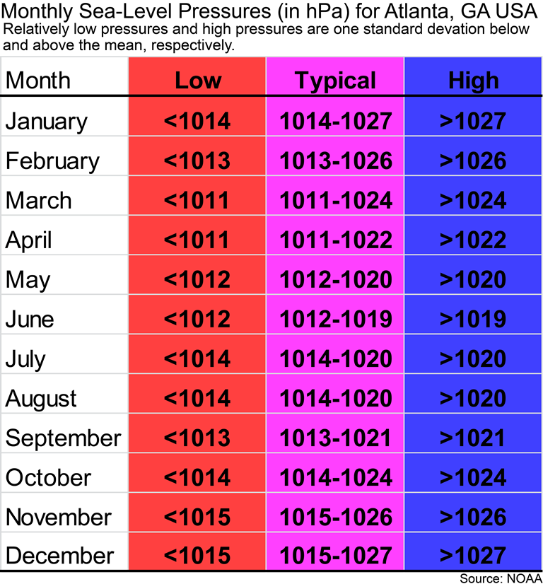
If you are a Geography 1112 student at GSU, then the following figure is for you. You might be wondering if the sea-level pressure for today in Atlanta is relatively high or low for Atlanta and what type of pressure system might be over Atlanta. Remember that the mean sea-level pressure for Atlanta is 1018 hPa. The image below gives you an idea of what would be considered low and high pressures for Atlanta for each month of the year. If you have a relatively low pressure, then it is probably cloudy outside. If you have relatively high pressure, then Atlanta’s weather is probably cloud-free and calm conditions.
You will learn more about pressure systems and atmospheric circulation later in this lab and in subsequent labs.
Section 5
In this section of The Troposphere lab, you will be exploring changes across space and time in key components of the troposphere. To accomplish this, you will be using Google™ Earth not only to examine how water vapor, cloud coverage, particulates, and ozone vary across the globe but also to examine how those atmospheric materials vary over the course of a year.
Let’s begin with a key component of the atmosphere in terms of weather and climate: water vapor. There is a picture of the water (hydrologic) cycle below. Take a minute to examine it and consider all the different processes that are a part of that cycle, as well as the sources of water (in its various forms) for each of those processes.
Now think about these processes on a global scale. It should make sense that the dominant source of water vapor in the atmosphere – which comes from evaporation of water on the Earth’s surface – is the Earth’s oceans. Note that the amount of water vapor evaporated from the oceans (436,500 km3 yr-1) is nearly seven times greater than the amount of water vapor evaporated/transpired from the land (65,500 km3 yr-1). Next, think back to the Solar Radiation & Seasons lab. Based on what you learned in that lab, it should make sense to you that tropical and subtropical oceans are huge sources of water vapor. You will get a chance to show off what you learned in that lab in the questions below.
Because all of the different processes within of the water cycle are constantly taking place and water is constantly move from the Earth’s surface to the troposphere and back again, water vapor has an average atmospheric lifetime of just ten days. As a result of this, it is valuable to track the movement of water vapor across space and time. You are going to look at a Google™ Earth file that will track such movement by showing month-to-month changes in 2010 in the concentration of water vapor. The data for creating that file was collected by the MODIS sensor on-board NASA’s Aqua satellite shown below.
The MODIS sensor presents the concentration of water vapor as the amount of precipitable water. Precipitable water is defined as the depth of water in a column of the atmosphere if all the water in that column were precipitated as rain; the unit is centimeters (cm). Watch the video below to see month-to-month changes in water vapor and focus on the area of highest water vapor concentration and how that area is distributed and moves across the globe during the course of the year. It is recommended that you click the Settings button (the gear icon) and choose a slower speed for the video; do this for subsequent videos as well.
![]() Q12: Which region of Earth generally has the highest concentration of water vapor and which region generally has the lowest concentration?
Q12: Which region of Earth generally has the highest concentration of water vapor and which region generally has the lowest concentration?
![]() Q13: Why would the distribution of water vapor change across the globe in the way that you identified in Q13? (i.e., Why would the region that had the highest concentration be expected to have the highest concentration and why would the region that had the lowest concentration be expected to have lowest concentration?)
Q13: Why would the distribution of water vapor change across the globe in the way that you identified in Q13? (i.e., Why would the region that had the highest concentration be expected to have the highest concentration and why would the region that had the lowest concentration be expected to have lowest concentration?)
Q14: How would you describe the movement of the area with the most water vapor over the course of a year? ![]()
![]() Q15: How does the movement you just described relate to what you learned in the Solar Radiation & Seasons lab?
Q15: How does the movement you just described relate to what you learned in the Solar Radiation & Seasons lab?
Through a visualization of water-vapor data, you have identified a pattern in the movement of the area of the highest water vapor concentration across the Earth over time. That area is known as the Intertropical Convergence Zone (ITCZ), and this feature will be examined again in this lab and also n the Lab 8 and 9, which focus on climate change.
Next, let’s focus on clouds, which are visible masses of liquid droplets or ice crystals or both. Watch the video below to see month-to-month changes in the amount of cloudiness. Cloudiness is provided as cloud fraction, and this is the proportion of a 1-km by 1-km grid cell that is covered by clouds. Cloud fraction was estimated from data collected by the MODIS sensor on-board NASA’s Terra satellite.
Q16: How would you describe the movement of the area with the most cloud cover throughout of a year? ![]()
![]() Q17: What is the general latitudinal ranges (e.g., 35° to 45°) that are mostly cloud-free throughout a year?
Q17: What is the general latitudinal ranges (e.g., 35° to 45°) that are mostly cloud-free throughout a year?
![]() Q18: For those latitudes that are mostly cloud-free, what would be the effect on the amount of solar radiation and also the temperature at the surface of that region from having such little cloud cover? Hint: You looked at a landmass in January at the end of Lab 1 (Solar Radiation & Seasons).
Q18: For those latitudes that are mostly cloud-free, what would be the effect on the amount of solar radiation and also the temperature at the surface of that region from having such little cloud cover? Hint: You looked at a landmass in January at the end of Lab 1 (Solar Radiation & Seasons).
The entire system you just witnessed is called the Hadley Circulation (see image below), and it is the large-scale movement of air in the troposphere with rising air at the ITCZ and sinking air outside the tropics in areas known as subtropical high-pressure cells. Humid air rises at the ITCZ, typically forms deep cumulonminus clouds as it goes to the top of the tropopshere, and then the air heads poleward and sinks in subtropical areas (i.e., subtropical highs).

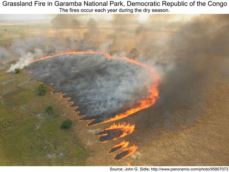
Let’s shift our focus from water to other substances in the troposphere. One form that other substances take is particulates, which are tiny solid or liquid particles suspended in the atmosphere. There are a whole host of different kinds of particulates in the atmosphere: Soot, smoke, smog, frog (just checking), ash, dust, spores, pollen, and various allergens. Natural processes contribute to the levels of particulates; for instance, deserts in subtropical regions are sources of windblown dust. Human activity, of course, also adds to the particulate concentration: “slash-and-burn” agriculture – in which forests are cut and burned to create fields for agriculture, pasture for livestock, etc. – and the annual burning of grasslands (i.e., savannas) in the tropics produces smoke (see images below). Fossil-fuel combustion (from cars, power plants, etc.) is another source of particulates in industrialized regions of the Earth.
Particulates range in diameter from 10 nanometers (to put this in perspective, a human hair is around 50,000 nanometers) to 10 micrometers (to put this in perspective, 1 micrometer is equal to 1000 nanometers). The reason we care about where actual particulates fall in this size range is that we are constantly breathing in the particulates. Particulates that are larger are generally filtered in the nose and throat and do not cause problems, but those that are 2.5 micrometers or smaller – labeled as PM2.5 (for Particulate Matter, 2.5 micrometers) — can settle in the bronchi and lungs and cause health problems. The effects of inhaling particulate matter have been widely studied in humans and animals and include asthma, lung cancer, cardiovascular issues, and premature death. Fossil-fuel combustion is a major source of small particulates.
Since particulates are suspended in the air, they represent a heterogeneous (‘uneven’) mixture of solids / liquids in a gas. The general name for such mixtures is aerosols, so that term should only be applied to the particulate-air mixture. Sometimes, though, people just use aerosols to refer to the particulates themselves. One way to measure the particulate concentration is by determining the aerosol optical depth, which is the degree to which aerosols (i.e. particulates) prevent transmission of light by absorbing or scattering the light. Areas with high aerosol optical depth values have high concentrations of particulates. You are going to view a Google™ Earth file showing month-to-month changes in 2010 in aerosol optical depth. Aerosol optical depth was estimated from data collected by the MODIS sensor on-board NASA’s Terra satellite. When you look at this file, focus on the areas of high and low concentration of aerosols (i.e. particulates). Watch the video below to see month-to-month changes in aerosol optical depth.
![]() Q19: When are there high concentration of particulates over central Africa just south of the equator (i.e., the southern portion of the Democratic Republic of the Congo)?
Q19: When are there high concentration of particulates over central Africa just south of the equator (i.e., the southern portion of the Democratic Republic of the Congo)?
![]() Q20: What is the most likely source of the high concentrations of particulates over the southern portion of the Democratic Republic of the Congo during the months you identified in the previous question? By the way, those particulates have been implicated as a possible cause of a recent drying trend in central equatorial Africa.
Q20: What is the most likely source of the high concentrations of particulates over the southern portion of the Democratic Republic of the Congo during the months you identified in the previous question? By the way, those particulates have been implicated as a possible cause of a recent drying trend in central equatorial Africa.
Q21: What is the most likely source of the high concentrations of particulates over eastern China? ![]()
Finally, let’s take a look at ozone (O3). Ozone at or near the surface (i.e. ground-level O3) is produced by complex chemical reactions that involve nitrogen oxides (NOx), volatile organic compounds (VOCs), and ultra-violet radiation. Ozone cannot be produced without solar radiation, and emissions of VOCs and NOx typically increase with an increase in temperature; because of these factors, you typically hear about ‘ozone alert’ days in the summer. Exposure to high O3 concentrations has been linked to increased hospital admissions for respiratory problems (e.g., asthma). People living in cities with high O3 levels have an increased risk of dying from lung disease. O3 also interferes with photosynthesis, which means it can lead to the reduced agricultural production and the death of forests. Finally, O3 in the troposphere is a greenhouse gas, and has thus contributed to the phenomenon of anthropogenic global warming. Therefore, ozone is “good” in the stratosphere and “bad” down at Earth’s surface (see image below).
Click TroposphericOzone_2010 to view an animation in Google™ Earth that shows changes in O3 concentrations from month to month in 2010. This animation is very similar to the animation you viewed in the Stratospheric Ozone lab. The difference is that the animation in this lab is showing O3 concentrations (in ppb) in the troposphere, while the animation in the previous lab showed ozone concentrations (in Dobson Units) for the entire atmosphere. Tropospheric O3 data were measured by the Ozone Monitoring Instrument and the Microwave Limb Sounder on-board NASA’s Aura satellite.
![]() Q22: During what months did you observe high ozone concentrations over and east of (i.e. downwind of) South America and Africa?
Q22: During what months did you observe high ozone concentrations over and east of (i.e. downwind of) South America and Africa?
![]() Q23: What factors contributed to the high ozone concentrations around South America and Africa?
Q23: What factors contributed to the high ozone concentrations around South America and Africa?
![]() Q24: You should have noticed that there were high concentrations of ozone in the Northern Hemisphere from May to September; why would the highest concentration occur during those months?
Q24: You should have noticed that there were high concentrations of ozone in the Northern Hemisphere from May to September; why would the highest concentration occur during those months?
![]() Q25: Why are we focusing on high levels of ozone in the troposphere in this lab while in the previous lab we focused on low concentrations of ozone in the stratosphere?
Q25: Why are we focusing on high levels of ozone in the troposphere in this lab while in the previous lab we focused on low concentrations of ozone in the stratosphere?
__________________________________________________________________________________________
Section 6
The Clean Air Act led to a major improvement in air quality in the United States. Initially, the act just supported research into what harmful effects could be clearly linked to the presence of certain pollutants in the atmosphere, and what levels of those pollutants represented reasonable risks. Then, in 1970, with clear results of that research in hand, politicians made decisions about regulating the levels of the pollutants. This legislation has been amended several times, with the last major amendment coming in 1990, when acid rain and ozone depletion were among the problems explicitly targeted.
In this part of the lab, we are going to investigate the effects that this act had on emissions of gases and particulates and then look at how those effects were related to changes in such things as the acidity of rain in the United States.
The first thing we will examine is changes in particulate emissions and concentrations for the entire country. Prior to 1987, total suspended particulates (TSP), was regulated; after the 1987 amendments to the Clean Air Act, PM10 (Particulate Matter, 10 micrometers or smaller), was regulated. The graph on the left below presents the emissions of PM10 and the concentrations of TSP (values are averages from approximately reporting 1,000 sites) from 1970 – 2010; the pie chart on the right below presents the sources of PM10 in 1970 and 2010, which will help you understand what lead to the changes in the graph.
![]() Q26: Why do you think the level of PM10 emissions changed so rapidly in the first part of the graph above (left portion) and less rapidly in the remainder of the graph (right portion)?
Q26: Why do you think the level of PM10 emissions changed so rapidly in the first part of the graph above (left portion) and less rapidly in the remainder of the graph (right portion)?
![]() Q27: What source had the largest decrease in PM10 emissions from 1970 to 2010? By the way, the decrease in PM10 emissions most likely caused a rebound in summer rainfall in the Atlanta region.
Q27: What source had the largest decrease in PM10 emissions from 1970 to 2010? By the way, the decrease in PM10 emissions most likely caused a rebound in summer rainfall in the Atlanta region.
Next, let’s turn our attention to nitrogen oxides (NOx) and sulfur dioxide (SO2) which are produced when fossil fuels (gasoline, coal) containing traces of nitrogen and sulfur are burned. SO2 is also released in volcanic eruptions (such as the 1991 Mount Pinatubo eruption that was mentioned in Section 2 of this lab). Below are images showing changes in NOx and SO2 emissions and concentrations for the United States. The NO2 concentrations are averages from 81 sites and the SO2 concentrations are averages from 121 sites across the country where those concentrations are monitored. As you can see in the graphs, the Clean Air Act led to major reductions in NOx and SO2 emissions and thus large decreases in concentrations in NO2 and SO2.
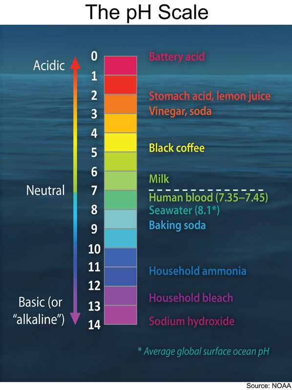
Acid rain is produced when there is an abundance of either SO2 or NOx or both in the atmosphere, as these gases react with water vapor in the atmosphere to make sulfuric acid and nitric acid. View the picture on the left below to visualize this process. The pH (power of Hydrogen) scale can help us keep track of acid rain, but only if we understand two things about the scale. First, because the ‘p’ or ‘power’ part of ‘pH’ stands for the fact that these numbers are ‘power of 10’ values. This means that pH is a logarithmic scale, like the decibel scale for sound. What that tells us is that changing the pH value by 1 really means the level of acidity is changing by a factor of 10. Second, because of how pH values are calculated, a smaller number on the pH scale means a higher acidity. So, putting those two things together, if the pH measurement at a particular place changes from 5 to 4, that should be interpreted as the acidity has increased 10 times. Look at the picture of the pH scale on the right below to become more familiar with the meaning of pH values.
‘Clean’ rain has a pH between 5 and 6, which means it is slightly acidic (that’s because of CO2 which is naturally in the air and forms carbonic acid). Electricity generation (e.g., coal-burning power plants) contributes SO2 and NOx to the air, causing the pH of the rain to decrease (i.e., making the rain more acidic). An interesting thing about Title IV of the 1990 Clean Air Act (which focused on acid rain) is that it penalized power companies for causing increases in the acidity of water within a certain radius of the plant. Acid rain can kill aquatic life forms and destroy forests. Acid rain has eliminated insect life and some fish species, including the brook trout in some lakes, and streams in geographically sensitive areas, such as the Adirondack Mountains of the United States. Some high-altitude forests are often shrouded in acid clouds and fog; as a result, entire sections of forests have died.
Now you are going to look at a Google™ Earth file that was created to show the changes in pH in different parts of the country from 1985 to 2012. Click on pH_1985-2014 to view this animation. Be sure to move the left-side tab on the time slider all the way to the right before starting the animation. If you do not, then the 2014 image will be the only that is shown.
![]() Q28: What was the general trend from 1985 to 2012 in the size of the area with pH levels less than or equal to 4.5 (below which the environment is considered to be acidic)?
Q28: What was the general trend from 1985 to 2012 in the size of the area with pH levels less than or equal to 4.5 (below which the environment is considered to be acidic)?
![]() Q29: Across that entire time range, in what part of the country are the pH values the lowest? In what part of the country are the pH values the highest?
Q29: Across that entire time range, in what part of the country are the pH values the lowest? In what part of the country are the pH values the highest?
You can open pH_Change to see changes from the mid-1980s to the present in the pH of precipitation. There is not a question associated with this, but hopefully you want to visualize how much the pH of rain increased, especially in the midwestern United States, over the past 30 years or so. Keep in mind that an increase in pH of one or so represents a 10x decrease in acidity … that is a huge reduction of acid rain!
So the Google™ Earth animation showed you that there has been a major improvement in the acidity of precipitation over the past 30 years, but knowing that begs the question, ‘What caused that change?’ There are two pie charts below designed to help answer that question. The charts show the change in total nitrogen oxide (NOx) and sulfur dioxide (SO2) emissions from 1994 to 2010 through the size of the pies. They also show the change in the percentage of emissions from different sources between those two years. Use the charts to answer Q26 below.
![]() Q30: What source of NOx and SO2 emissions was reduced the most between 1994 and 2010 and, as a result, helped to raise the pH level (i.e., decrease the acidity) of rain in the United States?
Q30: What source of NOx and SO2 emissions was reduced the most between 1994 and 2010 and, as a result, helped to raise the pH level (i.e., decrease the acidity) of rain in the United States?
Below are links to two Google™ Earth files, one which shows data for the locations of key emitters of SO2 and one which shows the same data for NOx. Do the following with these files:
• Open the SO2_Emissions_Facilities. The size of a red circle is proportional to the emissions of SO2 from a facility.
![]() Q31: What region of the country has the highest concentration of SO2 emitters?
Q31: What region of the country has the highest concentration of SO2 emitters?
• Zoom in on 3 – 4 of the larger red circles to get a closer look at the main emitters of SO2 found in that region.
![]() Q32: What did you learn about these emitters (e.g., their identity, the structure of the facility, etc.) by zooming in on them?
Q32: What did you learn about these emitters (e.g., their identity, the structure of the facility, etc.) by zooming in on them?
• Open the NOx_Emissions_Facilities. The size of a yellow circle is proportional to the emissions of NOx from a facility. The red circles for the SO2 emitters should still be present.
![]() Q33: How does the region of highest concentration of NOx emitters compare to the region of highest concentration of SO2 emitters? Why do you think this is the case?
Q33: How does the region of highest concentration of NOx emitters compare to the region of highest concentration of SO2 emitters? Why do you think this is the case?
![]() Q34: In Q29 you identified the parts of the country with the lowest and highest pH values. How does the information in these two Google™ Earth files explain which parts of the country have the lowest and highest values?
Q34: In Q29 you identified the parts of the country with the lowest and highest pH values. How does the information in these two Google™ Earth files explain which parts of the country have the lowest and highest values?
The state of New York has had rainfall with relatively low pH Values, despite the absence of large NOx– and SO2-emitting facilities. Eariler in this section you read about the impacts of the acid rain on the ecology of the Adirondack Mountains in New York. Check out the image below showing the typical flow in the middle troposphere over the USA and then answer the question below it.
![]() Q35: Why has New York had relatively low pH values?
Q35: Why has New York had relatively low pH values?
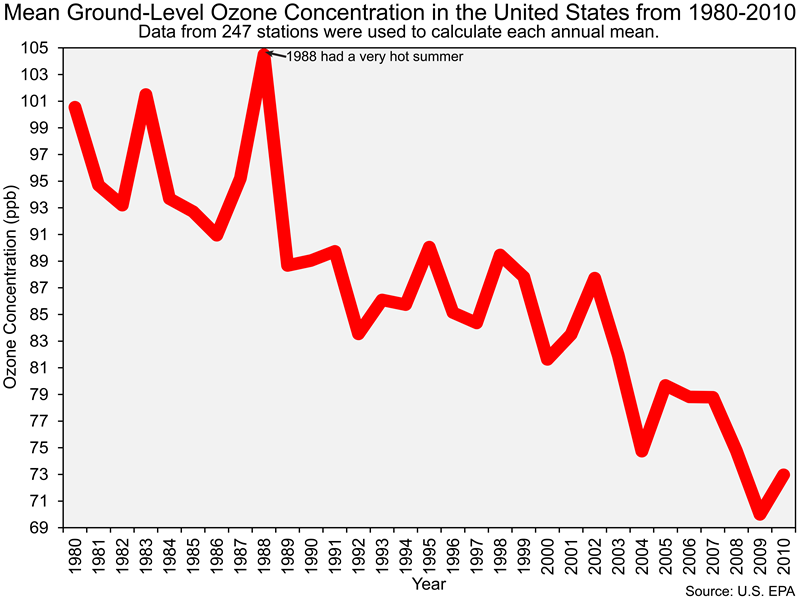
And before we end this section of the lab it is important that you also know that the Clean Air Act led to dramatic reductions in ground-level ozone concentrations in the United States, as you can see in the figure below.
![]() Q36: The reduction of emissions of what chemicals (e.g., pollutants) led to the decrease in ozone concentrations shown in the figure above?
Q36: The reduction of emissions of what chemicals (e.g., pollutants) led to the decrease in ozone concentrations shown in the figure above?
Section 7
Write responses of one to two sentences for each of the following big questions of the lab.
Q37: How does the troposphere differ from the stratosphere?
Q38: How does the composition of the troposphere change with a change in altitude and latitude?
Q39: How and why have pollution levels over the United States changed over the past several decades?


