![]()

A fascinating geographical, temporal, cultural and artistic journey through the history of the Look of the Games.
Go ahead – you’re in the driving seat!


More than 50 million visitors flocked to see all the novelties and attractions on show: pavilions for each of the invited countries, films by the Lumière brothers, a big wheel, and technological and architectural triumphs such as the Eiffel Tower, the Petit and Grand Palais, the Palace of Electricity, the Château d’eau, the first metro line, and more.
"If there was a place in the world that felt indifferent about the Olympic Games, Paris was the first."
(Pierre de Coubertin, Olympic Memoirs, 1931)

Women wore tight-fitting corsets, flared, trained skirts and high collars, with an emphasis on flowing lines, ample curves, frills and lace, in keeping with the Art Nouveau style.
Gentlemen’s clothing was much more understated, with dark colours.
During this prosperous, relatively frivolous period, fashion fluctuated between lavishness and a desire for a more casual style.

After Athens in 1896, it was Paris that hosted the second edition of the Olympic Games. But you wouldn’t have realised! There was no trace of the rings or the word “Olympic”.


A parade of gymnasts was organised in the Vincennes velodrome; a gold plaquette was given to the event winners, featuring the Goddess of Victory on the front and a victorious athlete brandishing an olive branch on the back.
So many symbols that we can link to the Games, but which were presented here as part of the decor of the World’s Fair buildings, just like the figures on the World’s Fair commemorative plaquette.
The Olympic Games were held as part of – and eclipsed by – the great event of the turn of the century.


In 1919, a series of peace treaties brought the First World War to an end and redefined geographical and political borders.
The countries of the world had paid a heavy price during the conflict, and now yearned to live in peace: “The war to end all wars / Never again.”


A period of resurgence, in which pleasure and exuberance became a way of life.
These were the years of Josephine Baker, Art Deco, the creations of Coco Chanel and the advent of jazz, radio, cinema, electrical appliances and more.
“A movement born in the Champagne of a newfound peace”, in the words of F. Scott Fitzgerald, author of The Great Gatsby.
A movement that sought to express, through all forms of art (interior design, architecture, fashion, graphic design, etc.), the need for levity and elegance after such a dark period of history.
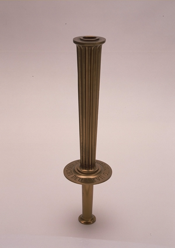
The rings were displayed on a white flag flown in the Olympic Stadium.
This was the first public appearance of the Olympic symbol, designed in 1913 by Pierre de Coubertin.
The Olympic visual identity was born, and grew over time. Today, the symbol is one of the most well-known and widely recognised in the world!
No Olympic rings on the poster for the Antwerp Games, but bunting made of national flags to represent the coming together of peoples, just like the symbol of the interlacing rings.


A mountain village rising up the slope above a lake at an altitude of 1,856 metres, in the Engadin valley in the canton of Graubünden, in south-eastern Switzerland.
The dominant central subject is the place being advertised. It is drawn with simple strokes and swathes of warm colours.
The idea is to illustrate the beauty of a place with a symbolic image drawn in close-up.
The aim is to offer an idyllic, timeless vision of the places illustrated. A combination of aesthetics and economics!
By using a visual language similar to that of tourism posters, St Moritz sought to take advantage of the Games to promote the country, the region, and the simple beauty of the surroundings, an ideal setting for winter sports.
By combining typical winter symbols and Ancient Greece on the medal, St Moritz brought the Swiss Alps and Mount Olympus together, marking the start of a separate Winter Games iconography.


Each country has its own special features that make it immediately identifiable: in the Netherlands, it is the windmills, which are clearly visible on the flat expanses of land. Their main function was to drive the pumps that drained the polders, so that the land could be cultivated once it had dried out.
It refers to an artistic trend used by a small group of architects and painters, and applied in the fields of painting and sculpture, but also architecture, decoration, furnishings and typography. It was a major artistic movement in the 20th century, considered as Holland’s most important contribution to modern art.
Jan Wils, one of the founders of the De Stijl movement, designed the tower that would house the Olympic flame.
It was inspired by the windmill, a typical symbol of the country; but, being avant-garde, its lines were clean and geometric.
And it was even orange as it was built in brick!
We’ve therefore come full circle…


The city founded, according to legend, by the twin demi-gods Romulus and Remus, who were suckled by a she-wolf. The city of Empire, Christianity, the Renaissance and the Vatican… A fabulous story engraved for ever in the architectural, cultural and artistic patrimony of Rome.


This name was attributed to Japan because it was considered the easternmost country in the world, and because the characters that make up the word Japan in Japanese literally mean “the sun’s origin”.
The symbol of a red sun is also displayed in the centre of the national flag.

The capital managed to rise up from the ashes of war, and an incredible economic boom was not far away.
Japan’s first high-speed train line, the Shinkansen Tōkaidō, was opened in 1964, connecting Tokyo and Osaka.
Inspired by the New Objectivity movement, this style sought to achieve an absolute and universal variety of graphic design, integrating all information within a functional typeface.
The style is known for its simple, visually effective typography, with “Helvetica” being one of the most widely recognised forms.
With the Olympic Games, Japan needed to speak to a global audience.
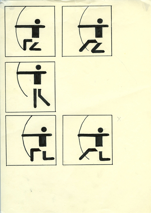
Looking for a way to transcend language – given the sui generis nature of the Japanese alphabet – Japanese graphic designers came up with an ingenious graphical system that was unique, clear and modern: pictograms!
Tokyo 1964 proved to be something of a milestone, as each Games edition since then has given rise to its own pictograms.
This was the first time that Asia had hosted the Games, and they provided the perfect opportunity to showcase the new Japan.
This was achieved thanks to a strong visual identity that was pure and eloquent, combining the red disc with the Olympic rings and embracing the Olympic values of excellence, friendship and respect.


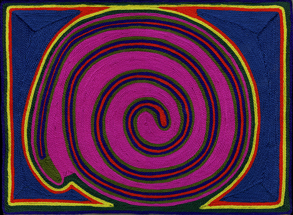
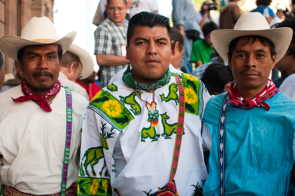
Historically, Huichol art was a sacred, solemn form of art steeped in religion. Traditionally, works consisted of cave paintings, stone sculptures or yarn paintings, and were given as offerings to the gods.
Bursting with bright colours and often featuring “naïve” and enigmatic images, this type of artwork was produced by the indigenous Huichol people of the Sierra Madre in the central-eastern part of Mexico.
In the 1960s, Huichol art gradually became more of a craft, and lost its spiritual dimension.
This term, which appeared for the first time in a Time magazine article in 1964, describes a style of visual art that makes use of optical illusions.
Op Art works are essentially abstract – they give the impression of movement and flashing or vibrating patterns.
They have a destabilising effect on the viewer, producing something between pleasure and displeasure and creating a dizzying sensation similar to that caused by mild intoxication.
André Courrèges: French fashion designer; promoter of the mini-skirt worn with go-go boots, and trapeze dresses that freed the hips and revealed the legs above the knee; and avant-garde creator, with his futuristic silhouettes.
He was nicknamed the “Le Corbusier of fashion” due to his functional style, which made use of geometric forms, and to the prevalence of white.
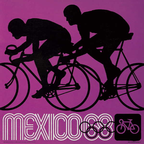
Born from the imagination of Pedro Ramírez Vázquez, the Mexico City 1968 Games emblem reflected the fashion of the time: hippy psychedelia.
The figure 68 was combined with the five rings to set off infinitely rippling waves: the result is an eye-bending design.

The colour palette of the visual identity of the Games in Mexico City featured 19 intense shades and a deep black, a reflection of what could be seen and experienced in the country itself!
An attractive and effective range for all forms of communication, whether pictograms, sports posters, tickets or hostess dresses.
When placed together, the posters create a frieze of lines and curves stretching out seemingly for ever!
And each sport has its own colour, its own pictogram, the logo and the rings: this has to be the Mexico City 1968 Games!


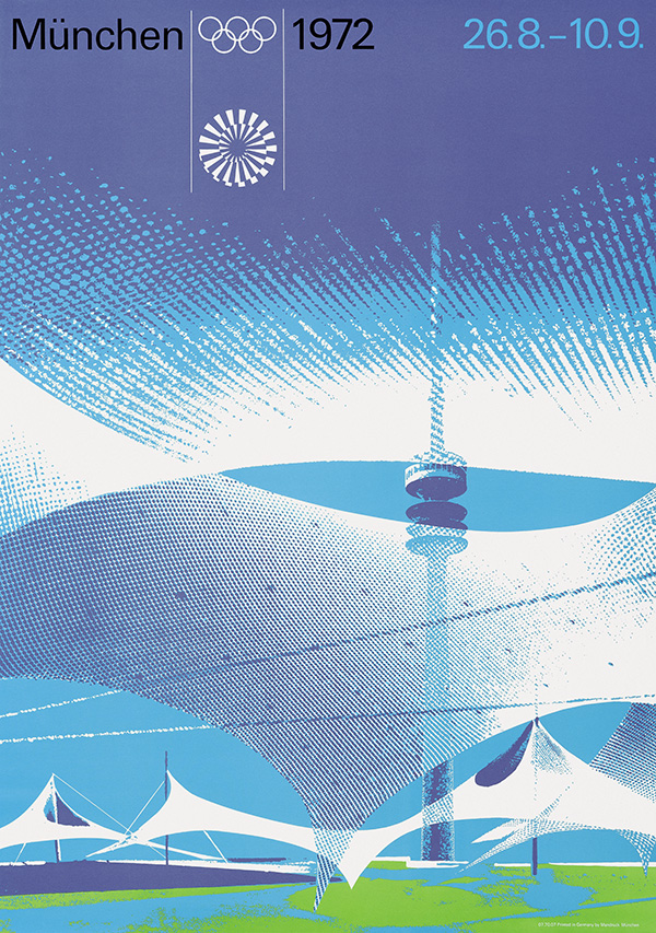
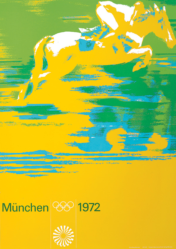
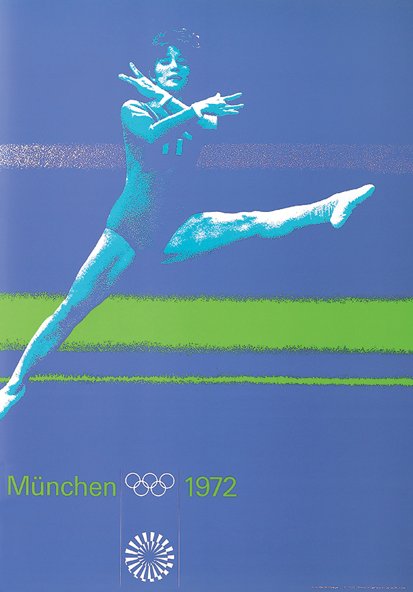
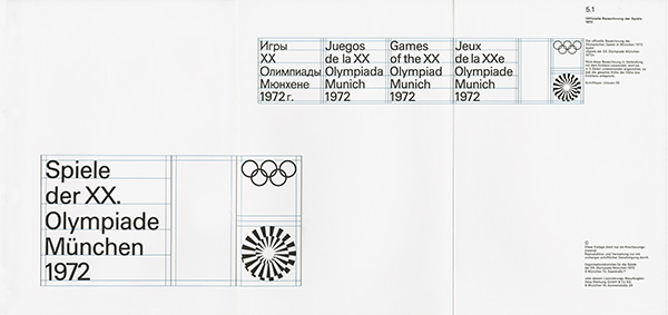
From the decoration of urban areas to matchbooks, everything went together; everything followed the playful, colourful spirit inspired by Otl Aicher and his team; everything contributed to make the Munich Games a historic and instantly recognisable edition.
“The setting for the Games plays a decisive part in their success.”
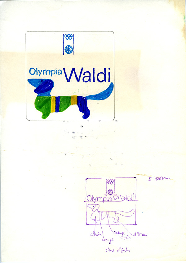
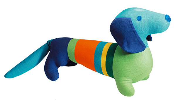
The Bavarian touch, with the most popular dog in Bavaria, and the six “Olympic 72” colours: corporate through and through!
« A mascot compatible with the entire design »
A silhouette made up of simple circles and straight lines, adapted to illustrate 21 sports. A precise and pared-down process to create a universal language that everyone can understand.


Los Angeles 1984 saw the first appearance of this term, which refers to the visual identity of the Games. It has been part of the Olympic vocabulary ever since.
The Look of the 1984 Los Angeles Games had a real West Coast flavour, with “intuitive” colours and an exuberant, typically Pacific freshness, in keeping with the spirit of 1980s festivals.
The décor was bursting with colour, stars and confetti were used to mark out the Olympic venues, and there was no lavish spending. Mission accomplished!


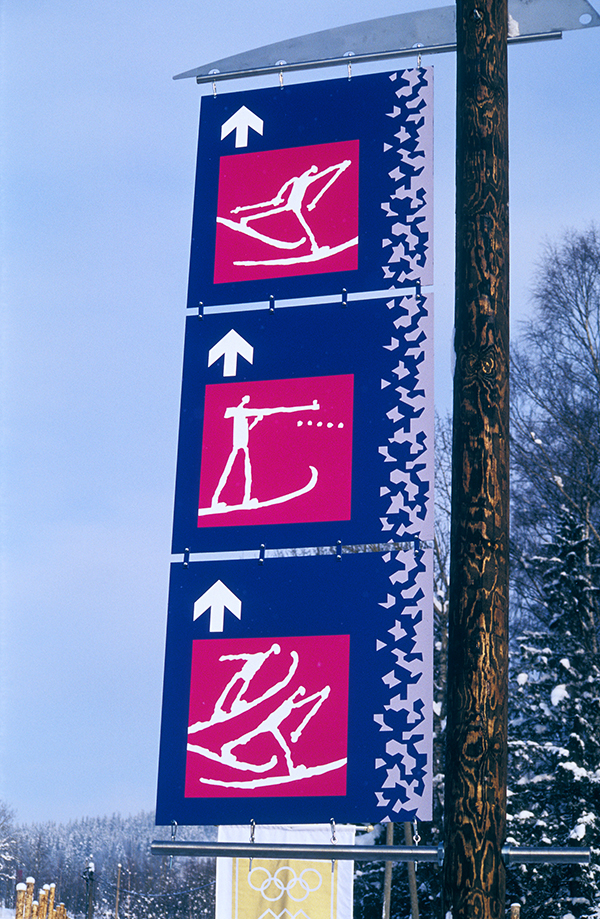
A threefold design concept: originality and Norwegian character, human contact, and contact between man and nature. Focused on respect for the environment, these were named the “White-Green Games by President Samaranch.
A national treasure inspired the pictograms: a rock drawing discovered on an island in the north of Norway, the oldest-known image of a person on skis, dating from more than 4,000 years ago!


This was the slogan of the Athens 2004 Games as, indeed, the Games returned to their country of birth, 108 years after the first Games of the modern era were held in Athens in 1896.


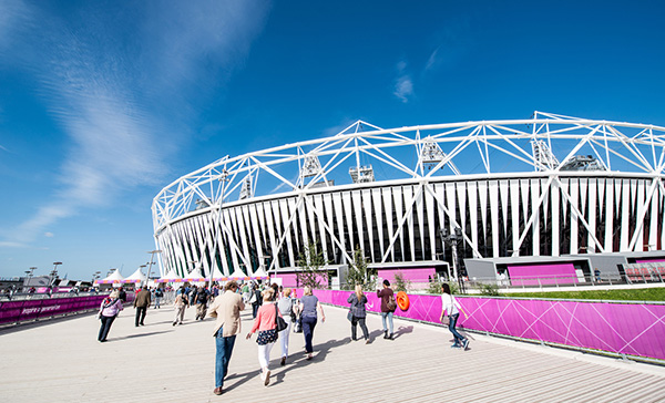
50 nationalities, 300 different languages, home of the avant-garde, the centre of high finance, miles and pounds, steering wheel on the right, cars driving on the left, the only city to have hosted the Games three times (1908, 1948 and 2012)...
The capital city of the islands that make up the United Kingdom certainly knows how to cultivate its originality.
![]()
The Olympic Museum does not house a collection, but rather an idea: Olympism.
Its mission is to showcase the historical, sporting, artistic and cultural dimensions of the Olympic world.
It does this by creating and developing themed programmes, both on-site in Lausanne and online.
Stay in touch; stay connected.

 Formed in 2009, the Archive Team (not to be confused with the archive.org Archive-It Team) is a rogue archivist collective dedicated to saving copies of rapidly dying or deleted websites for the sake of history and digital heritage. The group is 100% composed of volunteers and interested parties, and has expanded into a large amount of related projects for saving online and digital history.


