This article is also available in Russian, courtesy of Vlad Brown:
Погружение в создание Immersion
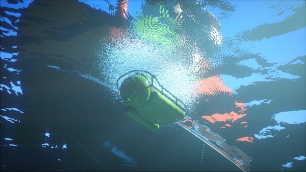
At last. Last December, we finally finished it. This video here is our last production, a 4 minute animation called “Immersion”. To be more precise, it’s a capture of what is usually referred to as a 64k intro. But more on that later.
Making it took the better part of two years’ free time. It all started during Revision 2015, a large event that takes place every year in Germany, during the Easter weekend. The both of us were chatting on our few kilometers long walk from the hotel to the party place, our faces battling the brisk morning air and the sleep deprivation. The previous night, the level of the 64kB competition had been high. Really high. The long established Hungarian group Conspiracy was finally back with a serious bombastic entry. Our best enemy Approximate was perfectly on time for its three years release cycle and showing a great deal of improvement in storytelling. The prolific Mercury now had a mature design style, with a foreshadowing intro title that left no doubt on the showdown.
That year, coming empty handed, we were not part of the competition, but we sure wanted to get back as soon as possible. Yet, after such a show we were wondering: slick look, great storytelling, great design… how could we get to that level? I couldn’t see what concept that, even perfectly executed, would have been a clear winner over any of those three. Not to mention that our tech was below any of them. And so there we were, throwing ideas on Hohenzollernstraße, when finally one of them stuck. A city rising out of the sea. That was a concept that, well executed, could maybe stand a chance at competing at the level this subset of that subculture had become. Revision 2016, get ready, here we come!
Revision 2016 zoomed past us with a whooshing sound… Revision 2017 it would be then. Alas, we barely made it to this new deadline either. At the party when people asked how it was going, the answer was a witty “It took us a year to make the first half, I’m confident we can make the second half in 24 hours”. We couldn’t. We did release though, but that second half was rushed, and it showed. So much so that we didn’t get even close to the podium. But we worked on it, gave it the love we thought it needed, and at last released the final version shown above.
What’s a 64k intro?
Demos are digital art creations at the crossroad of short films, music videos and video games. Although they present a non interactive experience, often music driven, like a music video does, they are rendered in real-time like video games are.
64kB intros, 64k for short, are like demos but with an added arbitrary limitation on the size: they must fit entirely within a single binary file of no more than 65536 bytes. No extra assets, no network, no extra libraries: the usual rule is that it should run on a freshly installed Windows PC with up to date drivers.
But how big is that exactly? Here are some comparison points.
In a 64kB file, you could store either:
- 400ms of wave sound with CD quality, or
- 3s of mp3 at 192kbps, or
- A 200×100 RGB .bmp image, or
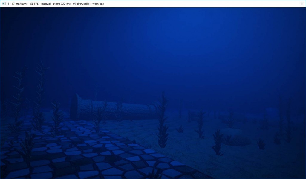
- A JPEG picture of medium size, medium quality, like this 800×450 screenshot from the intro:
Yes, you’ve read that right: that video embedded at the beginning of this post, fits entirely within a single file that takes no more space than a just a screenshot from the video itself.
When you see these numbers, it seems complicated to fit in the binary all the images and sounds that surely must be necessary. We talked previously about some of the compromises we make and some of the tricks we use in order to make everything fit within such a small size. But that is not enough.
In fact, because of these extreme constraints, usual techniques and tools cannot be used. We wrote our own toolchain instead, a task that is an interesting challenge in itself: we create textures, 3D models, animations, camera paths, music, etc. thanks to algorithms, procedural generation and compression. We’ll talk about those very soon.
Some numbers
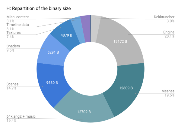
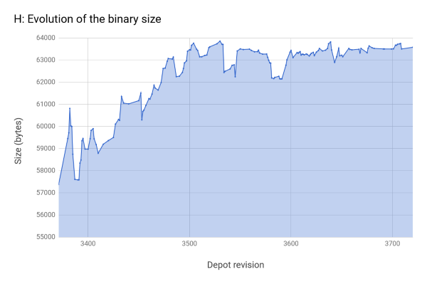
Here is an overview of how those 64kB are spent:
- Music: 12.4kB
- Meshes: 12.5kB
- Textures: 4.8kB
- Camera data: 1.3kB
- Shaders: 6.2kB, from 5k lines of code
- Engine: 12.9kB, from 20k lines of code
- Intro itself: 12k lines of code
- Time spent: hours, maybe over a thousand of them
Design & Inspiration
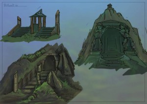
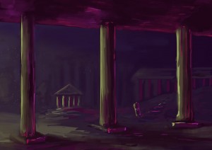
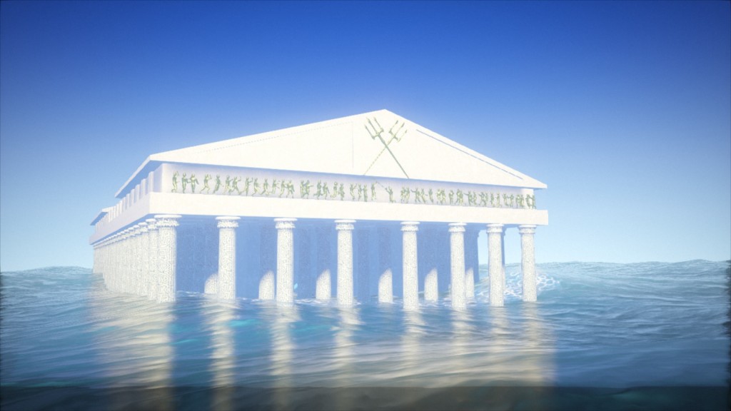
Having agreed that the central theme was a submerged city, one of the early questions was: how was this city going to look? Where was it located, why was it submerged, what was its architecture? One simple answer addressed all these points: it could be the legendary lost city of Atlantis itself. This would also explain and justify the emergence: by its divine nature (a literal deus ex machina). And thus it was so decided.
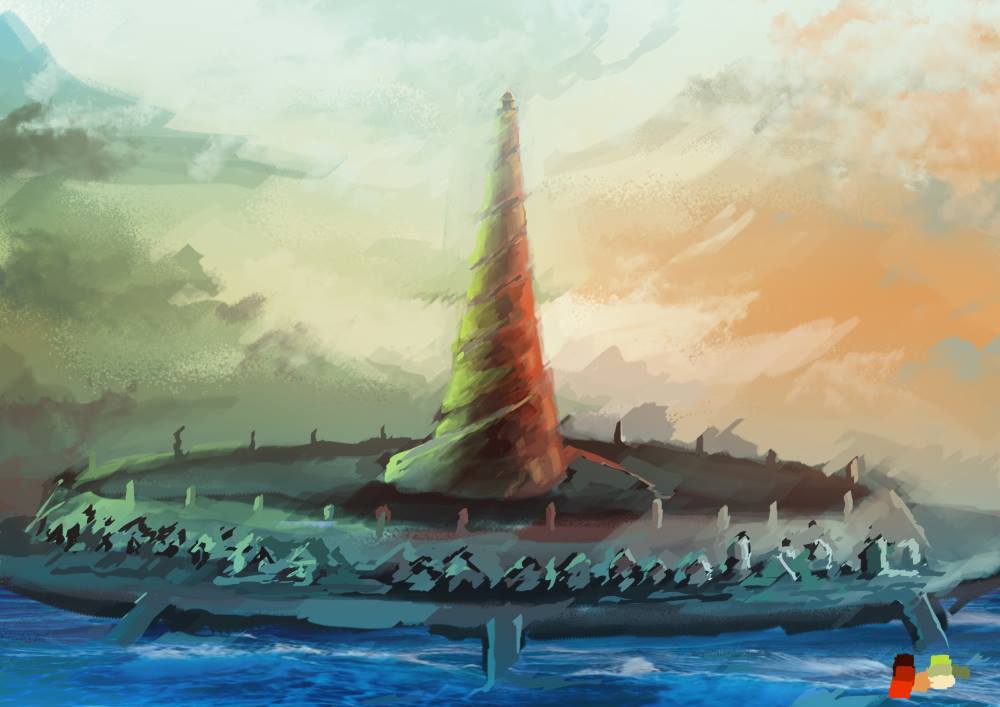
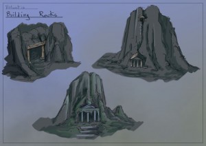
An early concept art for the emerged city. The artworks shown in this article were created by Benoît Molenda.
Two books guided our design decisions: Timaeus and Critias, in which Plato describes Atlantis and its fate. In Critias in particular, he details the structure of the city, its colors, its abundance of the precious orichalcum (which became an essential element in the temple scene), its circular shape, and the main temple dedicated to Poseidon and Cleito. Since Plato apparently based his description on countries he knew, a mix of Greek, Egyptian and Babylonian styles, we decided to stick with these.
Without proper knowledge of the topic though, creating convincing antique architecture seemed challenging. Instead, we decided to reproduce existing buildings:
- One is a reproduction of the Parthenon at Athens.
- Another one is a simplified version of the Tholos of Delphi.
- The viaduct is loosely based on the Pont du Gard and the aqueduct of Segovia.
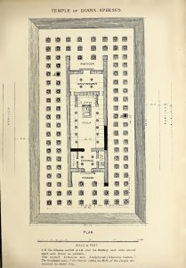
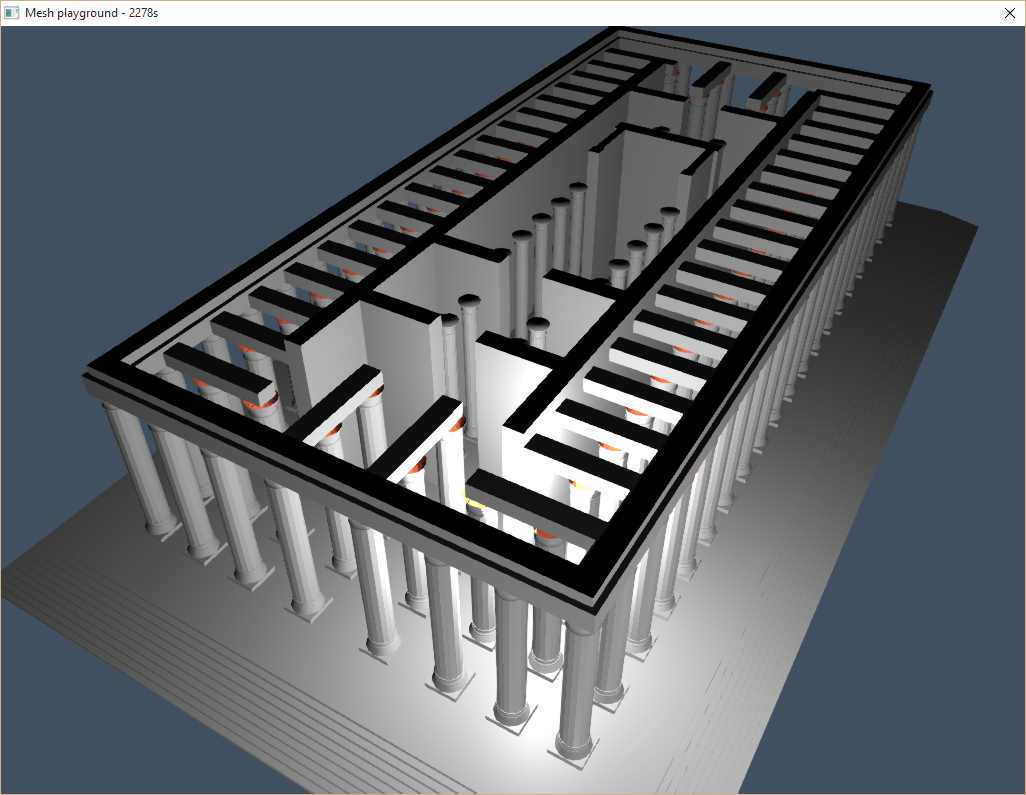
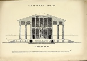
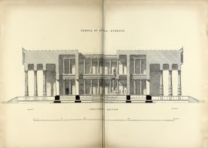
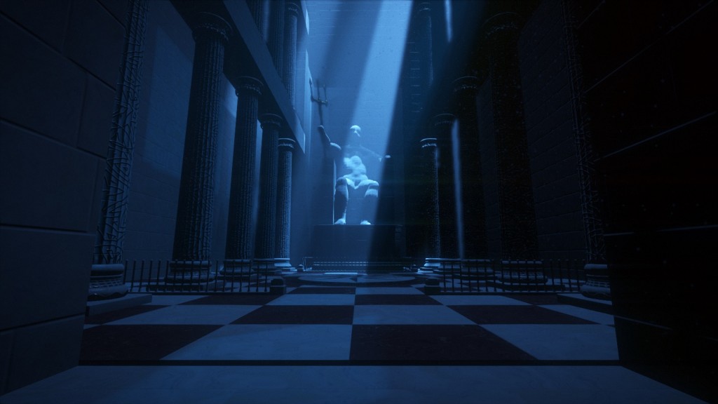
- The temple is essentially the Temple of Artemis at Ephesus, one of the Seven Wonders of the antique world.
Searching reference material for the Artemision turned out to be an unexpected, enriching experience. Originally, we were only looking for photographs, schemes or maps for reference. But when we learned about the name “John Turtle Wood”, things took a greater depth. Wood was the very person in charge of the searches and ultimate discovery of the temple location. Hoping that his name would yield better results than merely “Artemision”, we followed up, and we immediately found the book he wrote in 1877, in which he reports not only descriptions and drawings of the temple, but also his eleven years journey to find the lost site, his negotiations with the British Museum to stay funded, his relations with the local workers and the diplomacy involved before randomly digging holes.
Those books were essential to the design decision but above all, reading them brought us, as individuals, so much value from making this project.
And by the way, how is the roof supposed to look like? Some representations, including Wood’s, have a hole in it and some do not; there is apparently some controversy. We decided to go with an open roof model, allowing us to reveal the interior of the temple with a beam of light. The illustrations above show the floor plan and the cross sections, from the book Discoveries at Ephesus, compared to our work in progress model of the temple.
Achieving the desired look
We knew from the beginning that the appearance of water would be crucial to this intro. So we spent a lot of time on it, starting with watching reference material to understand the essential elements of underwater look. You might have guessed inspiration from James Cameron’s The Abyss and Titanic, 3DMark 11, or Ridley Scott’s Blade Runner for lighting.
Getting the right look wasn’t about implementing and turning on some epic MakeBeautifulWater() function. Instead, it was the combination of a series of effects that, when refined, would eventually trick us, the viewer, into accepting the illusion and feeling “This is it, we’re underwater!”. But one mistake, and the deception would collapse; a lesson we learned too late, when comments after the initial release pointed out where the illusion disappeared.
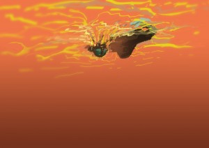
As illustrated above we also explored different non-realistic and sometimes extreme palettes, but we didn’t know how to achieve that look so we kept a classic color scheme in the end.
The water surface
The rendering of the water surface assumes a flat plane reflection. Reflection and refraction are first rendered to separate textures, using cameras on one side and the other of the water plane. In the main pass, the water surface is rendered as a mesh with a material that combines reflection and refraction based on the normal and the view vector. The trick is to offset the texture coordinates based on the water surface normal in screen space. This technique is classic and well documented.
It works well at a medium scale like during the boat scene, but at a larger scale like in the final emergence scene, the result looks artificial. To make it believable, an artistic trick we used was to apply a Gaussian blur to the intermediate textures. Blurring the refraction texture gives a murky look to the water, and a greater sense of depth. Blurring the reflection texture helps make the sea look more choppy. Moreover, applying more blur in the vertical direction imitates the vertical trails expected from a water surface.
The animation is done using simple Gerstner waves in the vertex shader, adding 8 of them with random directions and amplitude (within a given range). Smaller scale details are done in the fragment shader, including 16 more wave functions. A fake back-scattering effect based on normal and height brightens the tip of the waves, visible in the image above as small turquoise patches. During the launch scene, a few additional effects are added, like this rain drop shader.
Volumetric lighting
“How to make shafts of light for the submersible?” was one of the early technical questions. Maybe a translucent billboard with a beautiful shader could work? One day, we started experimenting with naive ray marching through a medium. We observed with delight that even in an early crude rendering test, and despite coder colors and the lack of a decent phase function, the volumetric lighting was immediately convincing. At that point, that initial billboard idea disappeared, never to be heard of ever again.
With this simple technique, effects we didn’t even dare think of where already baked in. As we added the phase function and played with it, it started to feel like the real deal. This opened a lot of possibilities from a cinematography point of view. But then there was performance.
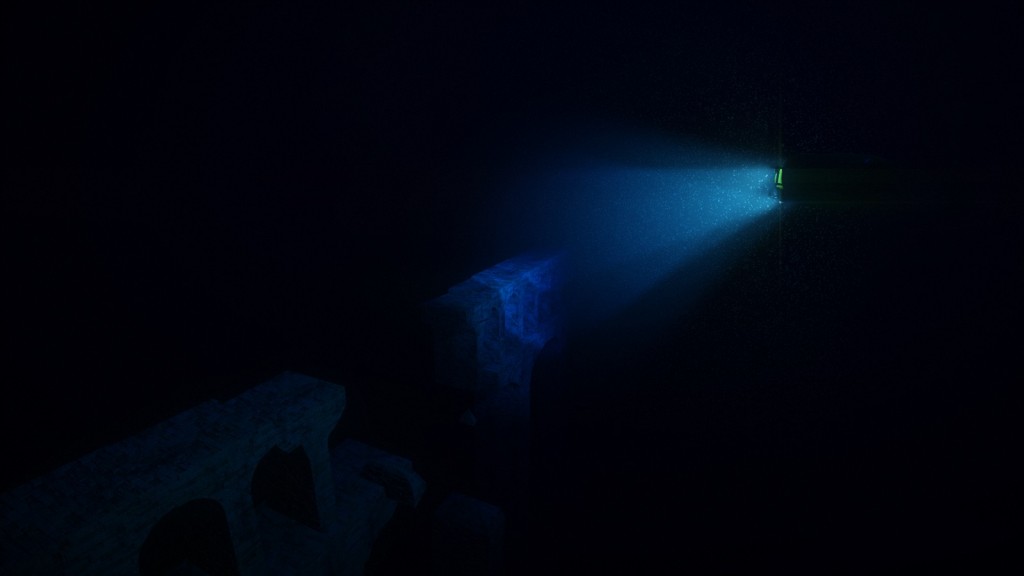
It was time to turn that prototype into a real effect, so we documented ourselves, read Sébastien Hillaire’s tutorial, his DICE presentation, and other approaches like the epipolar coordinates ones. In the end we settled with a simpler technique close to the one used in Killzone Shadow Fall (video here) with a few variations. The effect is done in one full screen shader at half resolution:
- On each pixel, a ray is cast, and its intersections with each light cone are solved analytically.
The math is described here (now guess on what occasion the article was written in the first place ;-) ). In terms of performance, it would probably be more efficient to use a light volume bounding mesh, but for a 64k it sounded simpler to use an analytic approach. Obviously, rays only go as far as the depth in the depth buffer. - In case the ray intersects, the volume inside the cone is then ray marched.
The number of steps is limited for performance reason, and they are randomly offset to remove banding. This is a typical case of trading banding for noise, visually less questionable. - At each step, the shadow map corresponding to the light is fetched, and light contribution is accumulated according to a simple Henyey – Greenstein phase function.
Unlike epipolar coordinates based approaches, using this technique it is possible to have heterogeneous medium density, which adds more variety, but we didn’t implement such an effect. - The resulting image is upsampled using a two passes bilateral Gaussian filter and added on top of the main render buffer. Unlike Sébastien’s tutorial, we don’t use temporal reprojection; we just use a high enough number of steps to reduce visible artifacts (8 steps in low quality settings, 32 steps in high quality settings).
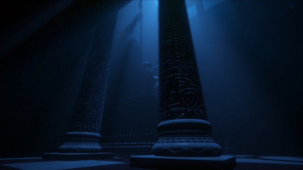
Volumetric lighting makes it possible to give a mood and a distinctive cinematic look that would be difficult otherwise.
Light absorption
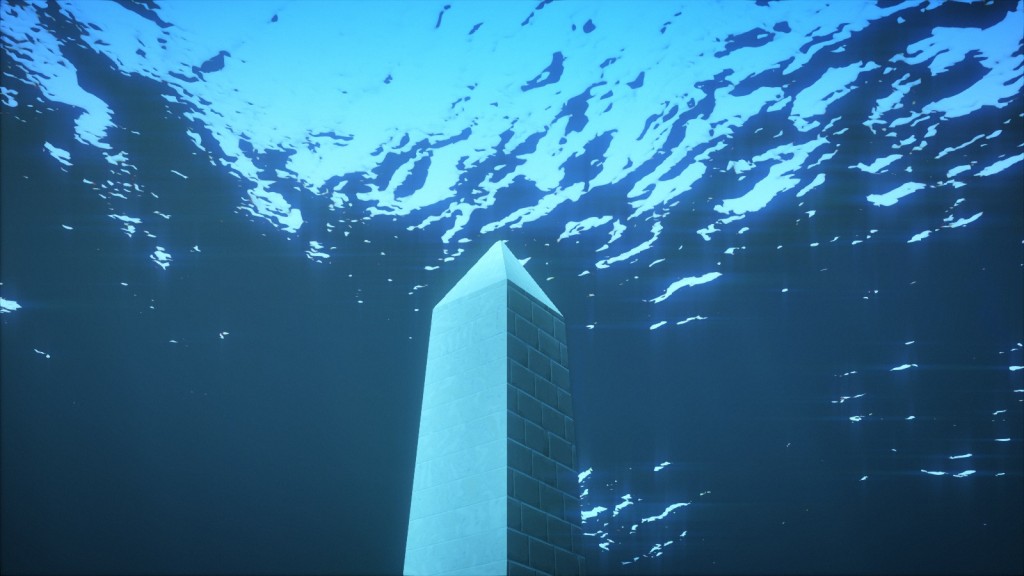
An immediately recognizable aspect of an underwater image is absorption. As objects get distant, they become less and less visible, their colors fading into the background, until they disappear completely. Similarly, the volume affected by light sources is reduced as light is quickly absorbed by the water medium.
This effect has great potential for cinematography, and modelling it is simple. It is done with two steps in the shader. A first step applies a simple absorption function to the light intensity when accumulating the lights affecting an object, therefore modifying the light color and intensity when it reaches surfaces. A second step applies the same absorption function to the final color of the object itself, thus modifying the perceived color depending on the distance from the camera.
The code roughly follows this logic:
vec3 lightAbsorption = pow(mediumColor, vec3(mediumDensity * lightDistance));
vec3 lightIntensity = distanceAttenuation * lightColor * lightAbsorption;

vec3 surfaceAbsorption = pow(mediumColor, vec3(mediumDensity * surfaceDistance));
vec3 surfaceColor = LightEquation(E, N, material) * lightIntensity * surfaceAbsorption;
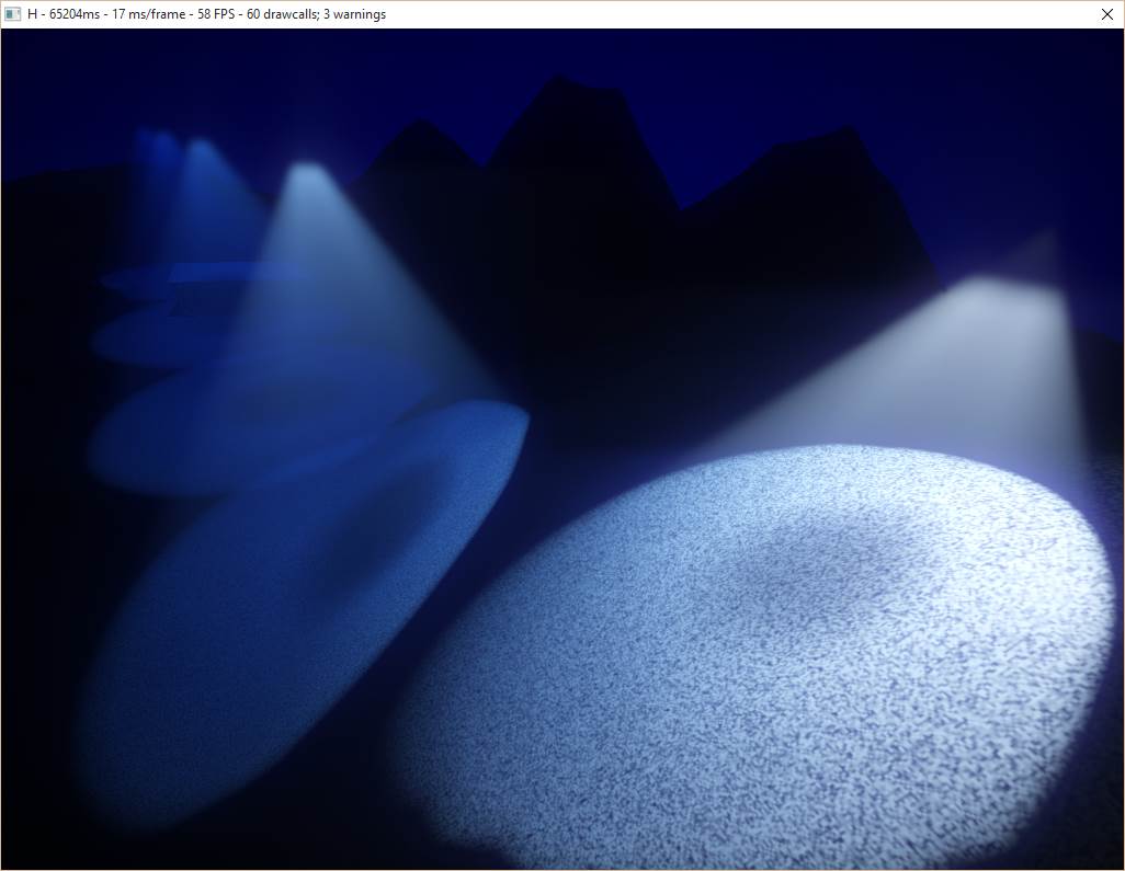
Test of light absorption in the water medium. Notice how color is affected by the distance from the camera and the distance from the light sources.
Adding vegetation
Seaweeds were an element we weren’t certain we could use. When reviewing the typical features of an underwater scenery, they were sitting among the top elements in the wish list, but their implementation seemed risky. Organic elements like that can be difficult to get right, and getting them wrong could break immersion. They would need to have a believable shape, be well integrated in their environment, and they might even require some subsurface scattering shading model.
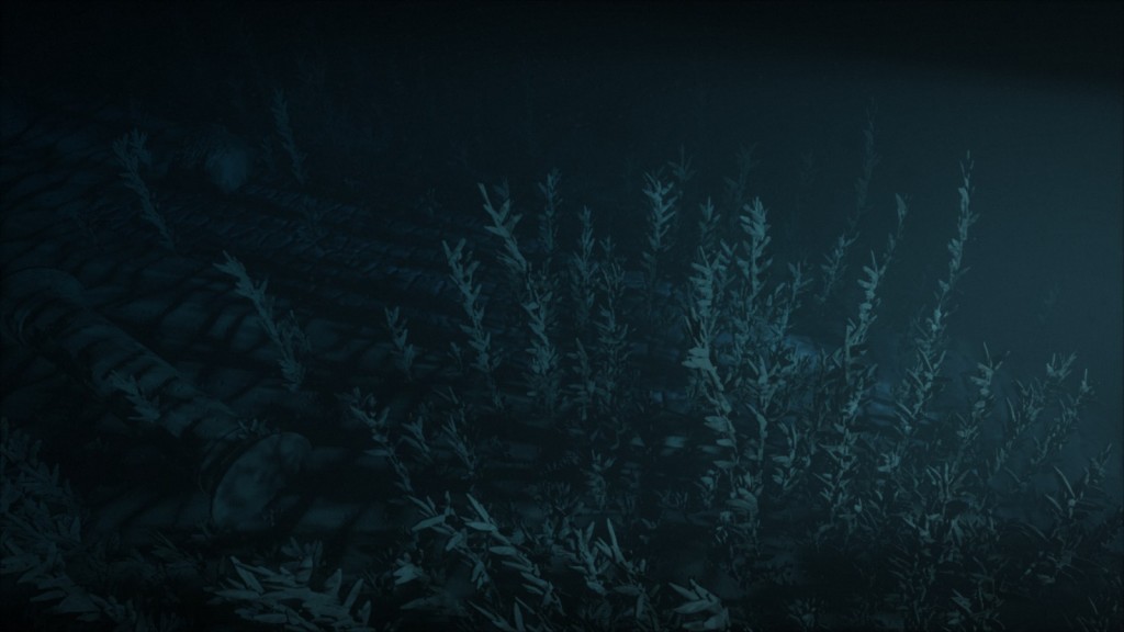
One day though, we felt inspired to experiment. Starting from a cube, scaling it, and putting a random number of them on a spiral around an imaginary trunk: from far enough it could pass as a long plant with many small branches. After adding a lot of noise to deform the model it was already starting to look half decent.
However as we tried adding those plants to a scene, we realized the performance tanked rapidly with the number of objects. This limited way too much the number of them we could put for the image to look convincing. It turns out our new unoptimized engine was already hitting a first bottleneck. So we implemented a crude ad hoc frustum culling at the last minute (in the final version a proper culling is used :) ), allowing the dense bushes visible in the demo.
With appropriate density and sizes (patches with normal distribution), and the details taken care of by the dim lighting, it was starting to look interesting. Experimenting more, we tried to animate them: a noise function to modulate the intensity of an imaginary underwater stream, an inverse exponential function to make the plants bend, and a sinus so their tip would swirl in the stream. Doodling some more, we stumbled upon the money shot: the submersible casting a light through the bushes, drawing shadow patterns on the seafloor as it passed off camera.
Giving volume with particles
Particles are the final subtle touch. Pay close attention to any real underwater footage and you will notice all sorts of suspended matter. Stop paying attention and it disappears. We tuned particles to be barely noticeable, preventing them from getting in the way. Yet they give a sense of volume filled with a tangible medium, and help sell the look.
The technical side is fairly straightforward: in Immersion, particles are just instanced quads with a translucent material. The rendering order problem due to translucency was simply avoided by setting the position along one axis according to the instance id. By doing so, they are always drawn in the correct order along that axis. The particles volume then just has to be oriented properly for each shot. In fact, in many shots this is not even done at all, since the size of the particles and the darkness of the scene made noticeable artifacts rare enough.
Music
How to fit a high-quality music in around 16kB? This problem is not new, and most 64kB intros written after .the .product in 2000 use the same concepts. The original series of articles is old, but still relevant: The Workings of FR-08’s Sound System.
In short, the idea is that we need the music sheet and a list of instruments. Each instrument is a function generating a sound procedurally (see for example Subtractive synthesis and Physical modelling synthesis). The music sheet represents the list of notes and effects to apply. It is stored in a format similar to midi, with some changes to reduce the size. During the execution of the program, the music is generated.
The synth has also a plugin version (VSTi) that the musician can use from his favorite tool. Once the music is composed, the musician clicks on a button, which will export all the data to a file. We embed the data in the demo.
When the demo is run, it starts a thread to generates the music in a giant buffer. The synth is CPU intensive and is not guaranteed to be real-time. This is why we start the thread before the beginning of the demo, while the textures and other data are generated.
Daniel Lindholm composed the music, using the synth 64klang created by Dominik Ries.
Workflow
Iteration time is one of the most critical aspects of the workflow when making a demo. In fact, this is true of many creative processes. Iteration time is king. The faster you can iterate, the more you can experiment, the more variations you can explore, the more you can refine your vision and increase the overall quality. So we want to eliminate as much as possible all the obstacles, all the pauses, all the little frictions in the creation process. Ideally, we want to be able to change anything, any time, and see the result immediately, as a continuous feedback while we are still making the change.
A possible solution, used by many demo groups, is to build an editor and create all the content inside the editor. We didn’t. Our initial approach was to write C++ code and do everything inside Visual C++. Over time, we developed a number of techniques to improve the workflow and reduce iteration time.
Hot reload all the data
If there was only one single advice to take away from this article, it would be this: make all your data hot reloadable. All of it. Make it so you can detect when the data is changed, load the new data when that happen, and update the state of your program accordingly.
One by one, we have made all our data hot loadable. The shaders, the camera, the editing, all the curves that depend on time, etc. In practice, we generally have an editor and the demo running on the side. Whenever we modify a file, the changes are immediately visible in the demo.
In a project as small as a demo this is fairly simple to implement. Our engine keeps track of where the data comes from, and a small function checks regularly if the timestamps of the corresponding files have changed. If they do, it triggers a reload of the corresponding data.
It might be significantly more involved in a bigger project where such changes are made difficult by complex dependencies and legacy design. But the impact it has on production cannot be overstated, so it is well worth the effort.
Tweakable values
Reloading data is all well and good, but what about the code itself? This is more complicated and we have approached this problem step by step.
The first step was a clever trick that allows to change the constant literals. Joel Davis described it in a post: a short macro that turns a constant into a variable with a piece of code that detects when the source file is modified, and updates the variable accordingly. Obviously in the final binary, this additional code is absent and only the constant is left. The compiler is therefore able to do all optimizations (for example when the constant is set to 0).
This trick is limited but it is really simple and can be integrated in the code in a matter of minutes. Moreover, although it is only meant to tweak constants, it can still be used for debugging purposes to modify a code path or toggle features with conditions like if(_TV(1)).
C++ recompilation
Finally our most recent update in our quest to make the code more malleable has been the inclusion of the tool Runtime Compiled C++ in our codebase. By compiling the code as a dynamic library and loading it, as well as doing a bit of serialization juggling, it allows to make changes to that code and see the result at runtime, without restarting the program or, in this case, the demo.
This is not perfect yet: the API is intrusive and constrains the design (classes have to derive from an interface), and compiling and reloading the code still take a few seconds. Yet the ability to make changes to the code logic inside the demo and see the result in situation enables a great deal of creativity. At the moment only our texture and mesh generators benefit from it, but in the future we want to extend it to the entirety of the “content” code.
To be continued
Here ends the first part of what will be a series of articles on the techniques used in H – Immersion. We’d like to thank Alan Wolfe for proof reading; you can check his many technical articles on his blog. In the next parts we will present in more details how the textures and the meshes are created.
Until then, feel free to ask any question or share your own experience.
Part 2: Texturing in a 64kB intro.
Part 3: Procedural 3D mesh generation in a 64kB intro.


