
Ming typefaces
This article needs additional citations for verification. (September 2022) |
You can help expand this article with text translated from the corresponding article in Chinese and Japanese. Click [show] for important translation instructions.
|
| Ming typefaces | |||||||||||||||||||
|---|---|---|---|---|---|---|---|---|---|---|---|---|---|---|---|---|---|---|---|
| Chinese name | |||||||||||||||||||
| Traditional Chinese | |||||||||||||||||||
| Simplified Chinese | |||||||||||||||||||
| Literal meaning | Ming typeface | ||||||||||||||||||
| |||||||||||||||||||
| Song | |||||||||||||||||||
| Traditional Chinese | |||||||||||||||||||
| Simplified Chinese | |||||||||||||||||||
| Literal meaning | Song typeface | ||||||||||||||||||
| |||||||||||||||||||
| Korean name | |||||||||||||||||||
| Hangul | 명조체 | ||||||||||||||||||
| Hanja | |||||||||||||||||||
| |||||||||||||||||||
| Japanese name | |||||||||||||||||||
| Kanji | |||||||||||||||||||
| Kana | みんちょうたい | ||||||||||||||||||
| |||||||||||||||||||

Ming or Song is a category of typefaces used to display Chinese characters, which are used in the Chinese, Japanese and Korean languages. They are currently the most common style of type in print for Chinese and Japanese. For Japanese text, they are commonly called Mincho typefaces.
Name
[edit]The names Song (or Sung) and Ming correspond to the Song dynasty when a distinctive printed style of regular script was developed, and the Ming dynasty during which that style developed into the Ming typeface style.[1] In Mainland China, the most common name is Song (the Mainland Chinese standardized Ming typeface in Microsoft Windows being named SimSun). In Hong Kong, Taiwan, Japan and Korea, Ming is prevalent. In Hong Kong and Taiwan, "Song typeface" (
Characteristics
[edit]Characteristics of Ming typefaces include the following:
- The basic structure of regular script
- Thick vertical strokes contrasted with thin horizontal strokes
- Triangles at the end of single horizontal strokes, called uroko (
鱗 , literally "fish scales") in Japanese, comparable to serifs. These are a print analog of the slight dot caused by pausing one's brush (dùn頓 ), the "pause technique", used to reinforce the beginning or ending of a stroke, which is characteristic of regular script. - Overall geometrical regularity
Possessing variable line weight and characteristic decorations at the end of lines similar to serifs, this type style is comparable to Western serif typefaces, as opposed to East Asian gothic typefaces which are comparable to Western sans-serif.
Variations
[edit]Often there are different ways to write the same Chinese character; these are collectively referred to as variant Chinese characters. Some of the differences are caused by character simplification, while others are purely orthographic differences such as stroke styling. The styling of the strokes used in old Ming typefaces came from the style used in the Kangxi Dictionary.[citation needed]
In mainland China, the modern standardized character forms are specified in the List of Commonly Used Characters in Modern Chinese. Some characters in the list differ from the Kangxi forms solely because they are Simplified while others differ because they use a different variant or orthography.
In Taiwan, the Standard Form of National Characters specifies the modern standardized forms. Unlike the mainland standard, the Taiwan standard uses mostly preexisting character forms but reference back to the style of regular script and reform Ming typefaces based on regular script style extensively, which had attracted criticism from many peoples.[3][4]
After the postwar kanji reforms in Japan, most of the Kangxi style characters were called kyūjitai (old style), while the reformed characters were called shinjitai, causing newer dictionaries to either incorporate both styles or omit the Kangxi styles. In Korea, most typefaces use the Kangxi forms.
There are differences between print and script forms of many Chinese characters, just as there are differences between copperplate and most people's handwriting. Some of these differences are persistent and specific to a style, but others may be no more significant than variations between individual typefaces. None of these variations usually hinder reading.
History
[edit]China
[edit]The printing industry from the Tang dynasty reached an apex in the Song dynasty,[1] during which there were three major areas of production:
- Zhejiang, where publications imitated the regular script of Ouyang Xun[1]
- Sichuan, where publications imitated the regular script of Yan Zhenqing[1]
- Fujian, where publications imitated the regular script of Liu Gongquan[1]
When Song lost control of northern China to the Jin
-
 A page of a publication from Zhejiang in a regular script typeface which resembles the handwriting of Ouyang Xun.
 -
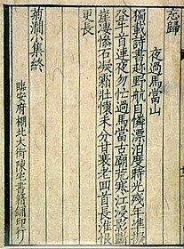 A page of a publication from Chén zhái shūjí pù.


Japan
[edit]
Ming typefaces (
The creator of modern Japanese movable-type printing, Motoki Shōzō (or Motogi), modeled his sets of type after those prevailing in China, having learned an electrolytic method of type manufacturing from the American William Gamble in 1869. Motoki then created, based on Gamble's frequency studies of characters in the Chinese Bible, a full set of type with added Japanese characters; in addition to Chinese and Latin characters, Japanese text uses the syllabaries hiragana and katakana.
Korea
[edit]In Korean, a similar category of typefaces for the Korean alphabet hangul was called myeongjo (the Korean reading for the same Chinese characters "
Ming typefaces in computing
[edit]Technically, only Chinese characters can be printed in a Ming typeface. However, most modern typefaces (that is, digital typefaces) often also include kana glyphs in a matching style, usually in a precise style resembling handwriting with a brush. Modern Ming typefaces also incorporate Roman type glyphs for Latin characters, letterlike symbols, and numbers. In its modern role comparable to that of western serif typefaces, both kana and Latin characters are usually part of a complete typeface.
Ming typefaces are used officially by the government of China, Japan and Korea.
See also
[edit]References
[edit]- ^ a b c d e f g "
漢字 書体 の歴史 " [History of Kanji Typefaces]. Kinkido Type Laboratory (in Japanese). Archived from the original on 2023-11-30. Retrieved 2024-02-20. - ^ DynaComware typeface list which calls standardized Ming typefaces "Song" and other Ming typefaces "Ming"
- ^ "
說 文 :臺 標 之 害 [刻 石 錄 ]". founder.acgvlyric.org. Retrieved 2020-06-20. - ^ "
為 甚麼 不 推薦 新 細 明 體 |許 瀚文 |立場 新聞 ".立場 新聞 Stand News. Retrieved 2020-06-20.
External links
[edit]- Nihongo resources: Japanese typefaces
- sci.lang.japan FAQ list of Japanese writing styles
- [chinese mac] Fontstypefaces included with Mac OS and Windows Archived 2007-02-05 at the Wayback Machine
- differences between some Ming typefaces
- www.kinkido.net Information on Chinese typefaces, including Ming typefaces. (in Japanese)